


LAZNIA 2 2013 - KAMILA SZEJNOCH Falowiec Colour System
15 - 30 September 2013
Laznia CAE, 5 Strajku Dokerow Street, Gdańsk Nowy Port

Aleksandra Litorowicz Public Space Research Institute
URBAN COLOUR TESTERS
SAMPLES OF URBAN COLOURS
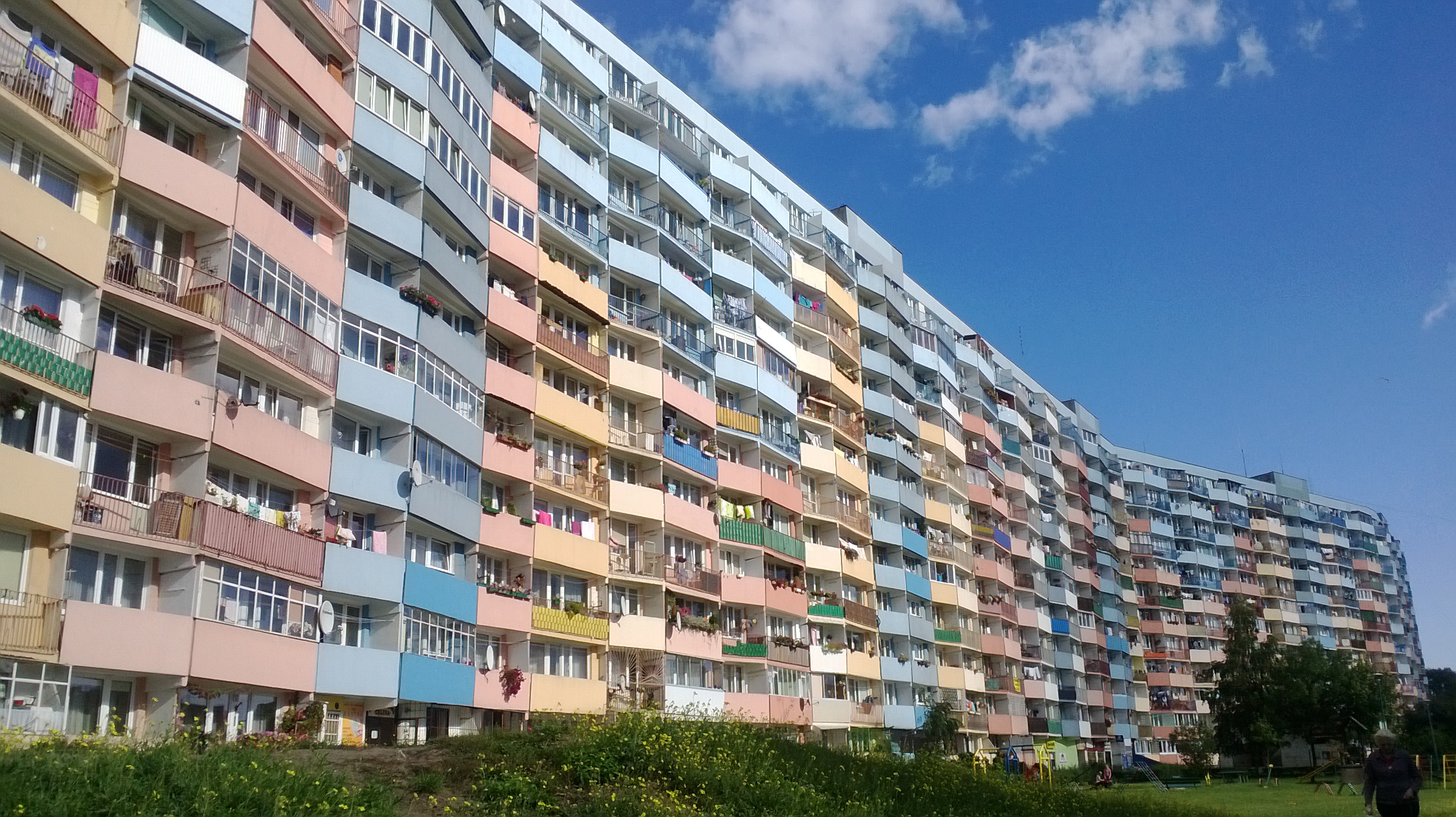
A decade of thermal insulation of Polish high-rise housing estates has transformed our landscape into a rather fanciful, but – interestingly enough – exceptionally consistent fashion. Throughout the country, blocks of flats take on pastel or fluorescent shades, often within the façade of a single building. They are sprinkled with geometrical figures or multi-colored confetti, and display vivid narratives: tower blocks are frequently covered with rainbows, suns or animals.
“Pastelosis” – this is how Filip Springer calls the disease affecting Polish high-rise in his latest book ‘Wanna z kolumnadą’ [Bathtub with a colonnade]. In his “medical interviews” with authorities of housing cooperatives in high-rise estates, he diagnoses the scale of the existing “epidemic”. The conversations indicate that the inhabitants simply feel good when surrounded by colour: it is a remedy to the grayness, sadness and boredom of everyday life. However, it also serves a peculiar “aesthetic value” that stands for prestige, pride while enabling inhabitants to stand out from their neighbors in the opposing block of flats.
This decisive move away from “dullness” often takes on the form of caricature and can have nothing to do with any kind of visual logic of the surrounding area. It should be noted that this is not a problem affecting housing estates alone. It is not difficult to come across market squares that have been renovated ‘funfair-style’, pudding-like frontages of tenement houses, or, a cacophony of colour and decorations on the walls of semi-detached or single-family dwellings. An interesting summary of these colouristic tendencies and choices is exemplified by Sławomir Elsner’s series entitled ‘Houses’. Elsner created a visual record of the aestheticising efforts made by the inhabitants who decorate their abodes with sweeps of pink, elements of yellow or geometrical effects.
Colour once served a specific function. For example, the colour layout of housing estates was often employed as a means of navigation around a typical vast high-rise. However, Polish construction law does not regulate color-related matters. Additionally, the color choices of insulated and plastered blocks is usually the result of the aesthetic preferences of female inhabitants, chairpersons of housing cooperatives or even, as Springer notes, a random secretary. Add to this the fact that the blocks are renovated at various times and belong to different cooperatives and you have a recipe for disaster: layers of colored polystyrene foam inexorably covering architectural detail and any differentiating embellishments - a multi-colored, geometrical “Lego land”, with no aesthetic or functional coherence whatsoever.
In simplest terms, the renewal of a given area takes place top-down, officially or spontaneously. Such “wild” revitalization may be found in artistic urban quarters, in various guerrilla actions and/or the spontaneous anesthetization of a given place by its inhabitants. It is not only the case of decorating balconies, planting flowers, bushes, garages, door jambs and common spaces. More importantly, the aesthetic preferences of inhabitants are translated to official decisions on colorizing estates during the process of thermal insulation - complete freedom and randomness in the case of colorization of prefabricated mass housing has resulted in the degradation of the cultural and physical landscape. The end result is a total lack of coherence and harmony.
better, more efficient mechanism of decision making between inhabitants and architects/designers with regard to colorization needs to be put in place. This kind of collaborative consultation can include discussing the color palette for a given place while taking into account site specific design/architectural parameters. The afore mentioned collaborative decision making process is not a simple repainting of the plaster, but rather a systematic sharing based on mutual understanding and working with the local community. In time, this may serve as model for revitalization within the broader social sphere.
It is important to keep in mind that “coloring” cities in Poland is difficult due to a variety of factors: climate determinants, pollution, lack of colour guidelines that would take into account meteorological changes, and historical aspects. A solution would be to offer inhabitants a codified colour palette book for a given area. This would help to harmonize not only housing estates, but entire cities in terms of colour.
In recent years, we have seen an increased interest in urban public spaces. Grass-roots initiatives are aiming to introduce order to aesthetic chaos in order to achieve new mechanisms of revitalization. Apart from presenting high-rise façades covered with “colorful leprosy, greenish pimples, diagonal seborrhoea, pink abscesses and grey blackheads”, pospoliteruszenie.com has a section that invites readers to present ideas for façade renovation. A thread entitled “Our Ideas for the Modernization of Communist Blocks” has been present in the Polish Skyscraper Forum since 2009, which presents several dozen original ideas. As well, “Filtrowa do usług” ['Filtrowa at your service'] is introducing order in their micro-scale of a single street - aiming to design a graphic concept for the Filtrowa street in Warsaw’s Ochota district, as well as, to adopt appropriate regulations concerning the aesthetics of shop windows.
Kamila Szejnoch’s project Falowiec Colour System realised as part of her residence at the Łaźnia Centre for Contemporary Art, serves as a pivotal example of how aesthetic change can occur at the community level. The inhabitants are going to be involved in painting the “tin town” (storage containers) that appeared spontaneously next to the development of Falowiec high-rise in Gdańsk, Poland - an unquestionable dominant feature in the local urban landscape. The challenge is considerable. Will the artist’s collaboration with the inhabitants mean that when choosing colors they will be guided by something more than personal preferences and/or habits? Will they identify with the revitalized places around them? Colour is communication and expression. What will be the final aesthetic result? Only time will tell.


 BIP
BIP